Category Archives: Reviews

Droid Bionic Review

This image has no alt text

The Motorola DROID BIONIC is Verizon’s first Android Phone to have both 4G LTE Connectivity and a dual core processor, immediately launching it into the elite smartphone realm. But with it’s delayed release – having first been announced in January and just launching in September – does it still carry enough bravado to warrant your hard earned dollar? Read  (and watch) on to find out.

Bionic Hardware Review

The Droid Bionic has an attractive and familiar look consistent with several other Motorola Droids (most notably the Droid X2) with a little lip below the 4.3-inch screen. While the Bionic is slightly thicker than the X2 it’s still only .43-inches thick, the thinnest 4G phone on Verizon to date, and it feels reasonably sized and weighted. It’s pretty impressive what Motorola is able to pack into the Bionic’s relatively small frame.

The 4.3-inch qHD display has 960 x 540 pixel resolution and is pretty darn good. Close inspection will reveal images and videos that seem to have a slight cross-hatched pattern underlayed which might irritate some, but overall I was impressed with the screen quality. The screen is made of Corning’s “Gorilla Glass”, an extra tough material that protects against scratches and broken screens. It’s not indestructible, but it makes an awesome difference.

Below the display you’ll find the typical Android buttons (Menu, Home, Back, Search) which are capacitive (touch sensitive) and very responsive. The left side features a MicroUSB port and a Micro-HDMI port, the right side has a volume rocker, and there is 3.5mm headset jack on the top of the phone along with a power/sleep button.

The Bionic has two cameras: an 8MP camera on the back and a VGA camera on the front for video chat and self-pics. Also on the front, on the other side of the earpiece, you’ll find an LED status notification light; this is a small feature but one I appreciate – it’s nice to have a visual indication that you have calls, messages, or e-mails awaiting you when your phone is otherwise “off”.

On the top/back, behind the power button, is a little slot to help pry open the battery cover. Call it nitpicking, but the battery cover along with the MicroSD Card and 4G SIM Card underneath were the most frustrating part of using the Bionic.

Don’t be shy: you really have to yank the battery cover to get it off (but if you break it don’t blame me!). Once it’s off you’ll find a 1735 mAh battery which you’ll need to remove to access the 4G SIM card. You can remove the MicroSD card without removing the battery, but neither are easy to finagle. Luckily we don’t usually need access to remove/replace these so the irritation will be rare.

The Motorola Droid Bionic has a solid set of features and an impressive spec list, but what makes this phone special is a certain Bionic trio:

  • 4G LTE Connectivity
  • 1GHz Dual-Core processor
  • 1GB RAM
These three hardware features together on one phone make the Bionic a powerful beast… let’s take a look at what this combination means for you.

The Bionic Trio (4G + Dual Core + 1GB RAM)

The Bionic is Verizon’s first phone to rock both 4G LTE connectivity and a dual-core processor- throw in 1GB of RAM and you’ve got an impressive combination of specs serving as your phone’s “engine” of sorts.

Let’s start off by looking at the Bionic’s 4G connectivity advantage which is an easier feat to illustrate. Check out the below video where we run three tests comparing the Droid Bionic’s 4G LTE speeds on Verizon with both 3G Verizon speeds using the Droid X and Home Wi-Fi (Comcast) using the Nexus One

As you can see, the quality of Verizon’s network spoiled my fun in two of the three tests. I’m in Baltimore where Verizon has an excellent 3G and 4G signal, so loading Phandroid.com and loading YouTube videos was lightning fast for both scenarios (even when compared to Wi-Fi). But Speedtest.net is where you truly see the power of Verizon’s 4G LTE network.

The Droid Bionic absolutely CRUSHES not only 3G but also Comcast Home Wi-Fi running the Speedtest.net app. With Verizon 4G I consistently got download speeds of 20+ Mbps and upload speeds of 3.5+ Mbps. It might be hard to understand how that extra power comes into play when 3G loaded websites and YouTube HD just fine, but think about this: if the 4G network only had 1 or 2 bars would it still be faster than Verizon’s 3G at 4 bars? My bet is yes and that’s where I think you would really see the value of the 4G  network- even in areas with only average connectivity your 4G should zoom while your 3G might struggle.

While the 4G LTE Radio provides quick downloading and uploading of data/multimedia, the dual-core processor splits the on-device work across two processors thereby lightening the load. Add the powerful 1GB of RAM and the Bionic powerfully pumps where other devices might putter along.

While it’s harder to visualize the importance of processors and RAM, one popular measuring tool is Quadrant which looks at a number of indicators and metrics, boiling them down to a “Quadrant Score”:

As you can see above, the Droid Bionic well outperforms a number of top Android smartphones. I consistently scored between 2,200 and 2,500. Quadrant is a great way to ballpark the value of hardware specs but it’s only a relative comparison tool and not an exact science. There are other benchmarks out there but I offer this example simply to prove the Bionic is indeed a beast.

Bionic Software Review

The Droid Bionic ships with Android 2.3.4, the most recent version of Android (at publication of this review). With a new version of Android expected by year’s end, some might be tempted to wait: although Verizon has promised to support software upgrades for 1+ years, they usually come with a fair delay.

That being said, the Bionic runs the Android OS rather flawlessly. It’s quick, without lag, and an overall enjoyable experience. Credit the dual-core processor and 1GB RAM here. From apps and games to web-browsing and videos, the Bionic offers smooth sailing smartphone use.

MOTOBLUR, the manufacturer’s former custom OS overlay, has been replaced with a less intrusive option which offers some of the same features – like resizable widgets – without the bulk that previously dragged down performance. However, the Bionic does come preloaded with a large number of annoyingly undeleteable apps and games, some welcomed and others dead weight.

Bionic Multimedia Review

The Droid Bionic comes preloaded with a bunch of apps that occupy a chunk of its 16GB of internal memory. Among them: Amazon Kindle, Blockbuster, City ID, GoToMeeting, Let’s Golf 2, MOTOPRINT, NFL Mobile, Quickoffice, Slacker, Videosurf, and ZumoCast. It’s also packed with Google goodies like Maps, Navigation, and Places while Verizon pre-installs their entire VCast lineup.

It’s a mixed bag, but some of the apps I already regularly use (NFL Mobile, Slacker) and others I tried for the first time and enjoyed (ZumoCast, VideoSurf).

ZumoCast is pretty awesome: quick signup, quick install on your computer, and all of a sudden your phone can access any file on your computer from anywhere in the world. Of course your computer has to be online and running ZumoCast, but after setting this up once it’s like your own little free version of Dropbox. You can choose what folders and files to share with your phone and let me tell you- it’s worth downloading and trying out. While many people assume preinstalled apps are bloatware, ZumoCast is nothing but files-on-the-go goodness from Motorola. Great stuff.

VideoSurf is like Shazam for TV and Movies – pretty neat – but after thinking about it seems a lot less logical. Whereas you’re often listening to music with no way of identifying the artist/song, you usually have access to see the programming guide when watching TV or movies. Unless you’re watching YouTube or another online video source, but I found using VideoSurf on my desktop monitors with YouTube a lot less effective. Even so, cool idea.

Additional multimedia features include HDMI mirroring through the Micro-HDMI port, DLNA connectivity, and the ability to turn your device into a mobile hotspot if you pay for the associated plan. All of these features are well documented and work beautifully with the Droid Bionic, although I’ve always had headaches and troubles with DLNA across the board.

The enjoyability of the Bionic’s multimedia is due in large part to the hardware specs: the 4G LTE connectivity allow you to stream videos and load webpages with great speed and the processor and RAM give the device more than enough power to operate effortlessly. The nitpickers will point to the less-than-perfect display as a flaw when compared to other top phones, but the vast majority of folks will find it perfectly pleasurable for all types of multimedia viewing.

Bionic Camera Review

Of all the high-end features of the Bionic I was most disappointed with the camera. After seeing spectacular pictures captured with the phones like the Droid Charge, my bar for mobile picture taking has risen. The Bionic photo experience comes in under that bar. While it’s capable of taking great photos, there are a couple of problems and irritations that prevent it from being a top smartphone shooter. To summarize:

  • Auto-focus is hit or miss and takes a few seconds to stick
  • Pictures may mis-focus and appear blurry
  • Colors can seem dull and/or washed out

The rear 8MP camera comes with an LED flash and auto-focus. I took several pictures in different environments with various settings and just didn’t see consistent results. See the samples below and click to enlarge each picture:

This picture of a flower is taken with all automatic settings and although the real-life color was vibrant and robust, we see the flower washed out and leaves too contrasted in the picture. Definitely doesn’t capture what I intended.

I got much closer on that same flower and used the Macro settings. Although the clarity and focus was good, something simply wasn’t right with the color balance. Interestingly enough, , what I saw in the viewfinder and what I saw once the picture snapped were very different, making me wonder if an imposed software filter causes unintended alterations. Maybe a software update can fix the color issues.

Landscape photos were generally better in terms of color and focus.

One thing I noticed was a delay/lag in the auto-focus finding a target and often improperly focusing, leading to blur. It didn’t happen the majority of the time, but enough to find myself resnapping the same picture several times on occasion.

The above picture is taken in a pitch black room and the results are as you’d expect: seeable but blurry when large. Not bad for a completely dark room though.

The above picture was taken with the front-facing VGA camera. Let’s face it: you aren’t trying to work masterpieces when using this camera, you’re either trying to video chat or take a self-pic. For these purposes, the Bionic was perfectly servicebale. Since I don’t have a British accent, standing in front of a bookcase full of Encyclopedias is my main gimmick to appear intellectual. Unfortunately, I’m undermined by the beard.

I found the 1080p video recording on the Droid Bionic to be really good considering the lackluster still photo results. Here is a video of my brother and I trudging into the backyard where a usually dry ditch made way for a steady stream during a crazy weekend of rain:

One thing I did enjoy about the Droid Bionic Camera was the software. Whereas I’m usually left sifting through menu after menu to find various settings and options over here and there and drag-click-open-zoom what? Yeah… the Bionic makes it easy with a simple side drawer that comfortably explains/expands further.

Let’s clear something up: unless you’re some type of mobile photo guru, chances are the Droid Bionic camera will be perfectly fine for you. There are plenty of settings to help optimize you pictures and I did indeed snap some good photos. It isn’t one of the best mobile cameras on the market by a longshot, but it’ll do the trick for your casual everyday photos- just don’t expect to blow up your Bionic photo of the Egyptian Pyramids into a poster for your wall.

Battery Life & Call Quality

The battery life and call quality are essential elements of phone use but typically get a footnote in reviews because of their unexcitability. The same goes here. I found call quality to be better than average and battery life to be average.

One thing Droid Bionic users NEED to keep in mind is to turn off resource intensive features when they’re not being used: this means 4G, Bluetooth, Wi-Fi, GPS, and other non-essentials. That alone will extend your battery life a good deal if you’re not already paying attention to these factors. I also imagine the Bionic will get more mileage out of the battery charge once more developers and Android in general better supports the dual-core architecture.

The bottom line is that the call quality is good, the speaker phone is reasonably loud, and the battery life falls in line with what any high-end Android Phone would yield. While I’d love to get more juice out of the Bionic, this is just an industry-wide issue that needs to be addressed. I’d suggest snagging a car charger and additional wall-charger so whether you’re at home, at work, or in-transit you can always stay plugged up. This and smart feature-use should solve a lot of your problems in the first place (with any phone).

Bionic Accessories

The Motorola Droid Bionic has a few accessories that are MUCH more interesting than car chargers and wall chargers. Try the Laptop Dock for example, which turns your Bionic into a fully usable laptop, promo image from Motorola below:

“Fully usable” is relative as you’re still limited to a somewhat netbookish environment but the nice thing is your phone does all the heavy lifting and already has your contacts, data, files, and information so no syncing is required. The Bionic actually powers the Lapdock which is more or less just a shell. Think Krang on TMNT. Or forget I just said that.

The Lapdock is kind of pricey at $300 but certainly a nice option. There’s also an HD Station for $100, Standard Dock for $40, Car Mount/Dock for $40, and Webtop adapter for $30. The latter of those is a nice bargain, allowing you to then connect your phone to an external display for using the Webtop experience that’s found on the Lapdock. It also lets you use the phone to scroll and type although bluetooth peripherals are welcome.

The Verdict

Friends and family constantly ask me, “What Verizon Android phone should I get?” and I’ve consistently told them, “Wait for a dual-core Android Phone with 4G LTE so that you’re phone is future proof.” Here it is.

The Motorola Droid Bionic is an excellent option, highlighted by the Bionic trio of 4G LTE, 1GHz dual-core processor, and 1GB RAM. A lot can happen in the 2-years until your contract is up, and these specs essentially “future proof” the Bionic, ensuring it’ll have the horsepower to run more resource intensive apps, games, and content as time goes on. It’s not the perfect device – the camera isn’t great and it’s missing a couple features like GSM/World radios and an NFC chip – but if these aren’t deal breakers then the Bionic is a top-shelf option and Verizon’s best.

Patient techies that crave the highest of high end phones may want to wait for the holidays when Verizon is likely to launch the rumored Droid Prime, but everyone else can confidently buy the Droid Bionic knowing it’s a great phone that should last them the duration of their contract… and considering the pace of today’s technology, that’s a mighty bold statement.

[App Review] Light Flow Allows You to Take Control of Your Notification Light (Samsung, LG Owners Need Not Apply)

This image has no alt text

I’m probably not the only one who has been annoyed by the lack of flexibility when it comes to today’s notification lights inside smartphones. Back when I had a G1, I could access a vast array of colors. Apps could tap into the LED light with ease and allow you to choose exactly which color you wanted LED notifications for that app to be. Now, you’ll get one or two colors, depending on if your phone has a low battery or not – green or blue for a notification, or red for a low battery.

Light Flow looks to change that, allowing you to take control of notifications for tons of different applications. Now, you can set that bright blue blinker exclusively Twitter, green for Facebook or whatever configuration you want that the application supports. It won’t let you apply custom configurations for any old application from the market, but the paid version unlocks a nice palette of apps, some of which you most likely use.

The downside is that you may need root to get things going on certain devices. In particular, HTC has locked down the permissions for LED control in their Gingerbread builds so you’ll need to be rooted in order to allow the application to change those permissions.

I’ve tried it on my EVO 3D – it did require root – and it worked great for the couple of applications I tried it with (SMS and Google Voice). It can be daunting at first but you’ll come to appreciate the amount of flexibility you’ll get with the sheer amount of options afforded to you.

Unfortunately, HTC, Sony Ericsson and Motorola phones are probably the only ones worth trying here. LG and Samsung phones absolutely do not work, and other OEMs may need special support. Contact the developers and they’ll see if they can add support for your particular device in future updates. Give the free application a shot (limited amount of applications) and see if it works out well for you. If it does, grab the full version for $1.23 in the Android market.

HTC Status Review

This image has no alt text

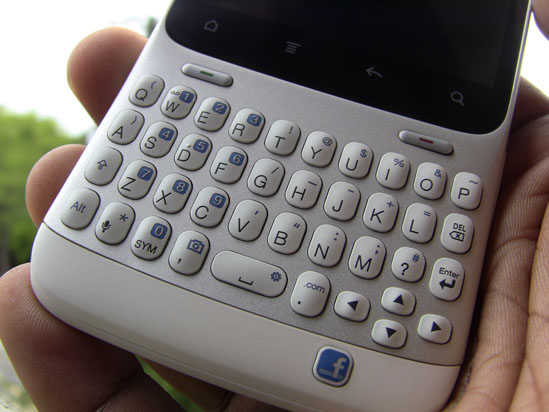
The HTC Status is America’s first phone with a dedicated Facebook button. While the service (allegedly) created by Mark Zuckerberg is without a doubt the most widely used social network in the world, the verdict on a device dedicated to exploiting its name, power and image is still out. AT&T hopes to capitalize on the iconic “f” logo, but is the phone good enough to pull people in?

Hardware

The HTC Status is a candy bar device with a portrait-oriented QWERTY keyboard and display. Below that keyboard is a Facebook button that gives you the ability to quickly post status messages or check-in to a location. This was HTC’s biggest selling point of the device when they first announced it (as the Chacha) back in February.

The keyboard is very attractive for those who are fans of the Blackberry-style orientation. More than it looks good and is familiar to that crowd, it feels great to type on. There is good track and feel here with a decent amount of tactile feedback. Keys are nice and “clicky” out of the box, but they might get a bit mushy over time.

Given the size of the keyboard coupled with the size of my hands, I thought the experience would be one of great pain. Fortunately, it wasn’t – I don’t know if it was due to the keyboard’s spacing or the device’s ergonomically designed body, but I had a much better time typing on this than I did any Blackberry or Palm device.

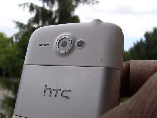
Moving past that, the device itself feels great in the hand. It’s light, but I wasn’t surprised by that. People will feel good holding it in their hands, too, as the build material and quality teeters on the line between this year’s string of HTC phones and last year’s. Not quite as much plastic as we were used to with HTC, but there isn’t a whole lot of metal on this thing either.

The display is landscape-oriented when holding the device upright, meaning all applications will default to their landscape views when launching them. The only time you’ll see an application or game in portrait mode is if that certain app or game requires portrait mode at all times. It’s a bit awkward to hold the phone sideways to use these apps, but that’s one of the caveats you have to deal with when going for a device like this.

This display itself is just as responsive and crisp as any new HTC phone. Things look crisp and clean compared to handsets with similarly-sized displays, too, as HTC chose not to skimp on the resolution. While you may have a bit tougher of a time reading text by nature, it’s still as good as it’s going to get in this form factor.

Inside is an 800MHz Qualcomm processor that’s similar to the chipset that powers the G2, Desire Z and other such phones. This processor is still more than capable of running HTC Sense smoothly. We didn’t expect much in the way of performance, but the Status is quite capable for the market it’s aimed at. With a bit of XDA love, you could potentially get a stable 1.2GHz overclock, but that depends on the development community.

You don’t get much RAM or internal storage, but the former hasn’t posed a problem for me in my week of testing and the latter will depend on who’s using the device. Some folks may need that ability to install applications to the SD card. We’ve also got a 5 megapixel camera sensor on the back and a .3 sensor on the front.

The battery life on this thing is quite good. Without a ton of work for the processor to push graphics to the small display, you’ll last all day as long as you aren’t looking at the phone 24/7. I’ve gotten more than 20 hours at one point, which I’d say is above average compared to other smartphones. Feature phones may give you more juice but this, of course, is no feature phone (although it may look like one).

Software

Here we have Android 2.3 with HTC Sense. It’s a modified version of Sense 2.1 for messengers, the first we’ve heard of HTC using this term. This definitely does differ from what you typically know as Sense. The home screen has been modified, for instance, to get rid of the Phone button (due to the advent of a physical call send button). On the very first home screen you can only use three rows on the left and right most columns due to the space the personalize and apps button take up.

Some widgets have been customized to fit smaller displays and some applications’ navigation bar (like the one you see at the bottom of the HTC launcher and in many of their applications) are set to the right. It’s still Sense at the end of the day, just looks a bit different.

As I mentioned before, thanks to the above-average processor and the low amount of work it has to do to push graphics to the screen, the software runs quite smoothly. Hiccups ware few and far between and I could only get it to stutter when absolutely trying to do way too much. For everyday use, this thing will serve any light-heavy user well.

Facebook

Facebook implementation leaves a lot to be desired. For a phone that has a Facebook button, I expected to be able to do a bit more than what the Status allowed me to do. I’d urge everyone to download the official application in the Android market if it weren’t for the fact that it can sometimes be hard to use with a display this size.

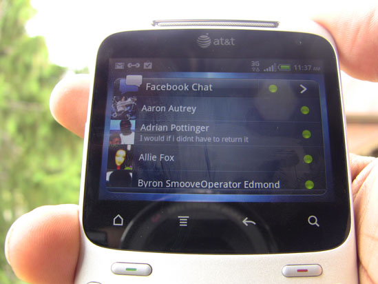
The button leads you to post a status message when pressed. You can also go straight to check-ins when holding it down. Also, the button will illuminate when viewing a webpage that will allow you to share the link of the page you’re on to Facebook. Likewise, photos and video can be shared when viewing them simply by pressing the “F” button.

I had hoped for added functionality – such as a pulsating light letting me know that I’ve received a comment or message. Naturally, I’d want to be able to jump right to those happenings as I press the button. Unfortunately, it doesn’t add much of anything to the experience unless you need the convenience of touching that button every 5 minutes.

Compared to recent updates to the main Facebook application, this implementation is downright crippled and not a joy to use at all. I appreciate HTC trying to do something a bit different. And it was smart for them to license the use of that Facebook button – it’s iconic and will turn enough heads at the point of sale.

But it’s such a rank experience from the main Android app that I’d urge users to struggle with using that on a very small screen or just visit the much-improved mobile web version of Facebook. On one positive note, the chat functionality has a dedicated widget and an icon in the apps try. Yippee.

Camera, Media, Odds, Ends

The camera on this thing is quite ordinary, relatively speaking. You won’t find the MyTouch 4G Slide’s virtually lag-free shutter. I would liken it to the quality of camera on the HTC DROID Incredible 2 and some of HTC’s other “S” phones. It’s serviceable for a phone of this type and will be pretty decent for uploading the odd mobile photo to Facebook here and there.

The front-facing camera is also decent, though we’re not sure if this was meant for video-calling on a device this small. With Facebook video-calling coming to Android sooner or later, it’s in good shape to receive that feature (in the main app, anyway). And maybe this is just wishful thinking, but I like to think that they included the front-facing camera so the campaign against bathroom mirror photos is scrubbed clean from this earth. They suck, people.

A few samples taken with the rear camera in several different situations:


It’s unfortunate that this thing doesn’t shoot HD video, but considering the nature of the device and the crowd it’s meant for, we can’t say we’re surprised. Video comes out looking OK, albeit a bit choppy. If you’re recording you may want to make sure your hand is steady as fast movements can make the video appear really choppy and you might also experience some screen tearing.

Photos are how I imagined them to be with the phone’s 5 megapixel camera – we’re on par with some of HTC’s latest phones, including the DROID Incredible 2, the HTC Thunderbolt and the HTC Sensation. As always, it’s going to be quite decent in daylight, but your mileage may vary in low-light situation. We’re very happy an LED flash is accompanying the camera in case you absolutely need it.

Gaming on the device won’t be ideal in most situations. It runs games well, but you’ll have to turn the device sideways half the time to play portrait-only titles. This looks odd and it feels clunky. Some games don’t scale down well, either, so your options are somewhat limited in the Android market. Likewise, watching films on the device will be a tad unpleasant. It’s OK, but if you need a bit of visual entertainment on a flight or during a boring stretch of time, you’d better take a tablet or a bigger PMP with you.

And all the other important things – call quality, radio performance, GPS, etc – work just fine. I would have preferred a bit more in-call volume, but that’s minor and was my only complaint in this area.

Overall

It’s a decent phone for social heads, Facebook or otherwise. The keyboard is ideal for heavy volumes of tweets, texts and status updates. With the Facebook button, we had hoped for better and deeper integration, but the only advantage the HTC Status has over any other phone in terms of “Facebooking” is that you can post a status message with one press of a button from within any application.

All of that aside, it’s still a phone worthy of a chance. HTC’s solid build quality, as always, doesn’t really fail. It’s actually surprising how solid the phone feels considering this is a huge departure from the norm for them. Due to the nature of the phone, portrait-only apps don’t really work too well on the Status, but that fault lies with the lack of development standards and we can’t really blame HTC for that.

As long as you go into this purchase knowing that this isn’t meant to be a multimedia-serving powerhouse (it certainly isn’t), you’ll be fine with the Status. It won’t overwhelm you, but it’s a great addition to a group of devices with this form-factor that’s lacking in devices from powerhouse manufacturers.

Motorola Droid 3 Review

This image has no alt text

Though it wasn’t the first phone to run Android, the Motorola Droid is the handset that put Google’s mobile operating system on the map. Two iterations later we sit with the Motorola DROID 3 the latest take on the QWERTY slider with some of the biggest changes to the line we have seen to date. The Droid 3 brings double the firepower with a 1GHz dual core processor, increases screen real estate to 4.0-inches, and offers a vastly improved physical keyboard. While it doesn’t feature Verizon’s 4G LTE,  the Droid 3 easily ranks among the carrier’s best.

Hardware

The Motorola Droid 3 upgrades the hardware of its predecessors in nearly every way, and does it in a form factor that feels fresh while retaining the classic Droid look. A dual-core 1GHz TI OMAP 4 chipset runs the show here, offering superb speed and responsiveness. The 3.7-inch that became standard for the first two versions of the handset has given way to a 4.0-inch qHD display, offering more screen real estate while not adding much size to the device. It is only slightly larger around the edges than the Droids that came before it, and is in fact the thinnest form of the QWERTY slider yet.

The sliding battery cover has been replaced by a removable back plate with a cut out for the Droid 3′s 8MP camera. A physical camera key is absent but you will find a volume rocker, 3.5mm headset jack, HDMI and microUSB ports, and a power on/off/standby button. All of these things are pretty standard, and none quite stand out compared to the Droid 3′s show stopper: its greatly improved 5-row full QWERTY keyboard.

For the first time the Droid 3 features a fifth row of dedicated number keys. Thanks to the larger size of the device as a side effect of the larger screen, key spacing and arrangement makes for a delightful typing experience. The membrane keyboard of older Droid devices has been replaced by individual keys that respond with a satisfying click when depressed. Gone are complaints about flat keys or thumbs tripping over themselves. If you bought this phone for one feature and one feature alone, the keyboard would be it.

All of this hardware adds up to a device that runs Android 2.3 and Motorola’s custom user interface without a hitch. Speaking of which…

Software

The Droid 3 features the latest version of MotoBlur, one which thankfully does away with a lot of the fluff and offers a fairly basic and traditional Android interface. You get a selection of widgets, apps, and optimizations to create what amounts to your average Android experience. And that is somewhat of a problem here, as the phone’s interface ends up feeling just a bit too average. A few small tweaks here and there (such as a power toggles in the notification dropdown) could have offered something beyond what stock Android offers, and we miss stock Android here. It’s hard to figure out why Motorola moved away from the stock interface after the wild success of the original Droid.

Pre-loaded software includes all of your standard Verizon goods, including V Cast apps, Kindle, Blockbuster, Slacker, and NFL Mobile. Most users won’t get much mileage out of these, but they do offer a rather nice software package out of the box that showcases the Droid 3′s power.

Camera

The Droid 3 features an 8MP camera with LED flash capable of 1080p video capture, a serviceable combination for the most part. Images didn’t come out as crisp and clear as we’d like from an 8MP snapper even after fooling around the phone’s settings. The Droid 3 offers a good amount of options for different lighting conditions and shooting scenarios, but compared to the camera offered by other devices settings still seem fairly limited.

Video easily impressed more than still photos, though again settings were just a bit too limited for our taste. This could easily be improved with a third party camera solution or a bit more care and attention in crafting shots. For spontaneous shooting or capturing life’s random moments, you won’t be disappointed with the results. But this one might not replace your standard point-and-shoot.

Web Browsing/Gaming/Media

As with other devices with 4-inch+ screens and qHD resolutions, media and web consumption is one of the highlights of the Droid 3. If you have ever used an older Droid, you might agree that the 3.7-inch screen seemed just slightly too small in offering web content, but here browsing is just about as good as it gets. The phones hardware offers responsive and quick scrolling and zoom, and flipping to landscape mode to use the hardware keyboard offers an unmatched web experience. For the same reasons, viewing video on the Droid 3 is a pleasure.

3D gaming is on par with other handsets of its class. The Droid 3 comes pre-loaded with Lets Golf 2 and the game plays as well here as it does on any other device we have tried it on. 2D gaming went down without a hitch, and again the Droid 3′s keyboard offers great options for fans of gaming on their Android device. Hardware keys maximize screen real estate for games while offering a more traditional handheld gaming experience.

In Conclusion

There is a lot to like about the Droid 3, and for owners of older Droid handsets it feels like the perfect upgrade. Still, a lack of 4G LTE means this handset isn’t future proofed, and a two-year contract will keep you off of Verizon’s next-gen network for the foreseeable future. It’s a shame 4G is missing here, as the hardware keyboard and high-end specs offers a unique experience unmatched in Verizon’s Android lineup. You’ll have to weight the importance of the two for a final decision, but trust me, that is what it will boil down to.