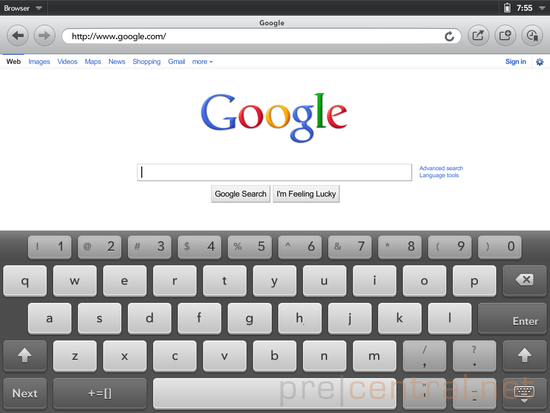
Although we’re supposed to wait a couple more months till the HP TouchPad webOS 3.0 tablet is available, there’s no reason why we shouldn’t take a peek at its operating system. The screenshots below show you a glimpse into the UI of the latest webOS version. These came from a webOS 3.0 emulator, in case you’re wondering.
The Maps app in the new webOS is based on Bing Maps and it’s a minimalist piece of software. There’s a search box and Search/Directions options at the top, plus buttons for extra details and favorites. Considering HP is a Microsoft partner, getting Bing as the map provider seems like a logical move.
The advantage of Bing Maps is that it offers a 45 degree birds-eye view and there’s also a scale at the bottom right corner, showing you how far you zoomed. Moving on to the rest of the UI, TouchPad’s device menu is placed in the right top corner, showing the time and battery icon. If you tap it you get other info, such as the current date, battery percentage, screen brightness and a couple more.
In the Music section, you get a basic browser on the left, using Song, Artist, Genre and Album to go through songs and individual playlists. There’s a list view on the right side and a control bar across the bottom of the screen. Extra info about the interface can be found on Precentral.
Related posts:
- HP TouchPad Coming in June, WebOS Reaches the PC Before The Year End
- HP TouchPad Debuts; Dual-Core WebOS 3.0 Tablet Coming This Summer
- HP WebOS Tablet Gets Teased Ahead of February 9 Debut (Video)


